Show Name and Print Design

Our show finally has a name!

Kalopsia

noun. The delusion of things being more beautiful than they really are.

We agreed that this Greek word applied well to our show as we wanted to show the side of love that isn’t glorified in cinema, the real, gritty, mundane, exciting, side of love. Kalopsia is what happens in film, our show aims to establish and combat that.

Now comes that all-important time to give our show a branding and a public-facing presence, as well as us as a company. We have sourced an in-kind designer to create our print for us, giving him designs we created ourselves for inspiration and allowing him to create the final image for audiences to see.

I mocked up some sketches of potential design ideas as follows:

IMG_3929IMG_3930

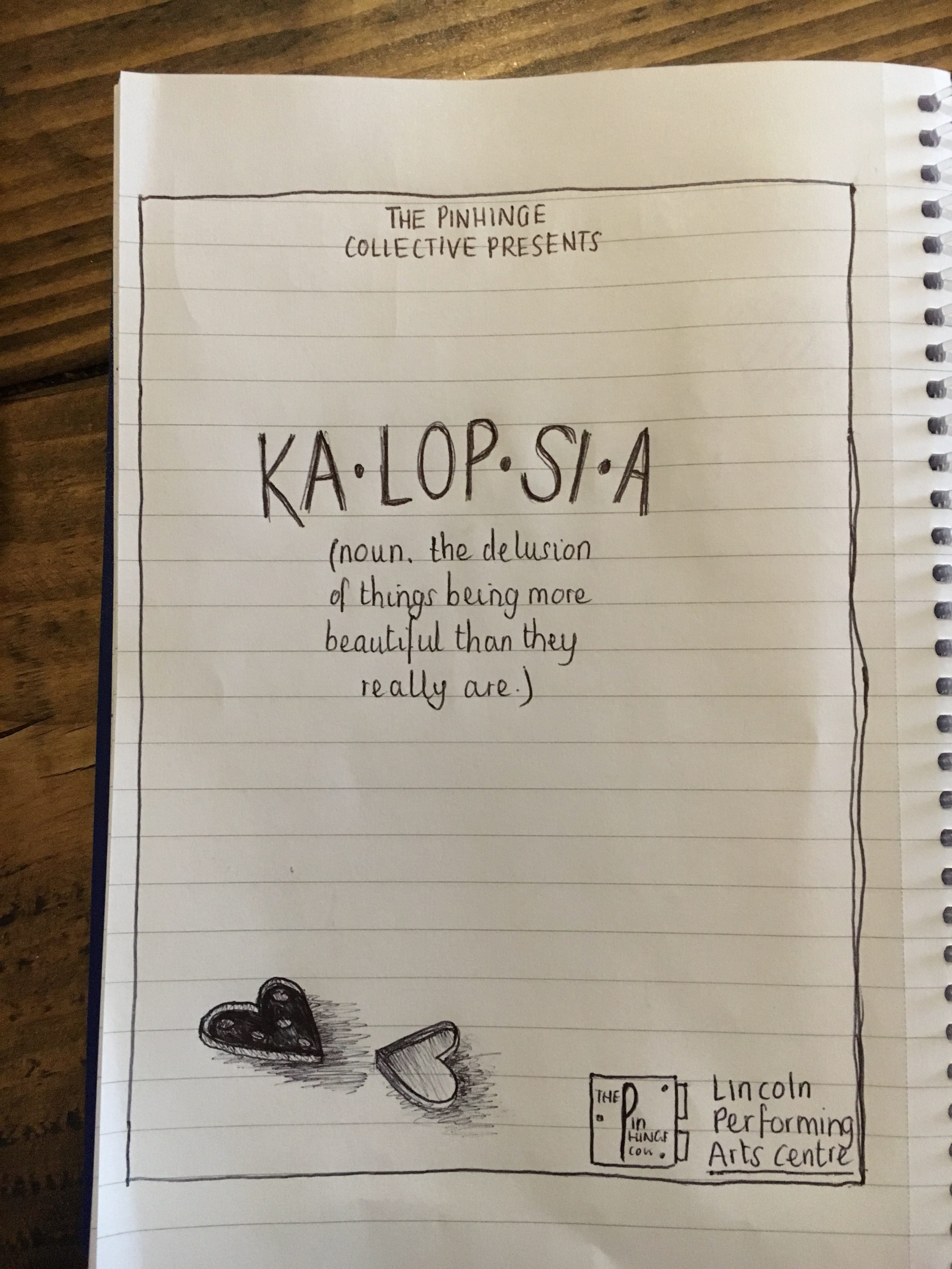
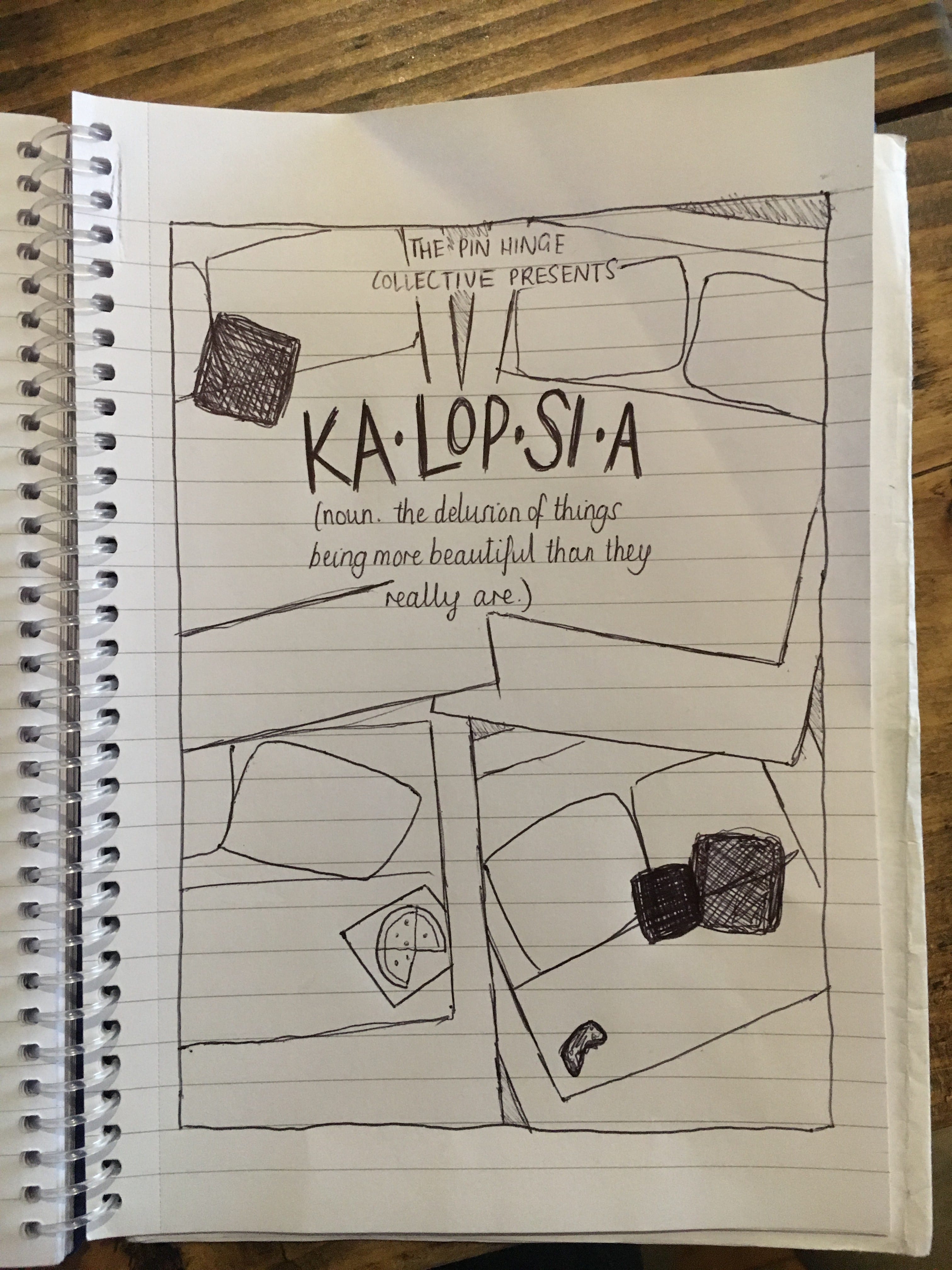
We had the idea of creating something that people associate with love, yet giving it a twist to show something less commonly seen in films, such as empty pizza boxes, tissues, remote controls, general mess, dirty underwear, etc.

However, the premise of our show changed somewhat during this process – we revisited the name ‘Kalopsia’ and its meaning and decided that rather than focusing exclusively on love as the form of ‘delusion’ we discuss, we wanted to look at the way people view their everyday lives and what delusions we imagine on a day to day basis, i.e. the way we perceive ourselves and the situations we find ourselves in, going back to the idea of reception theory that we discussed in our first rehearsal. Many of these situations within the narrative of our show will also focus on love, therefore we wanted to implement that into our print, yet also show more of an element of the human and humanity: each individual has their own delusions.

After being in talks with our designer regarding this, he sent us some mock-up images of potential designs:


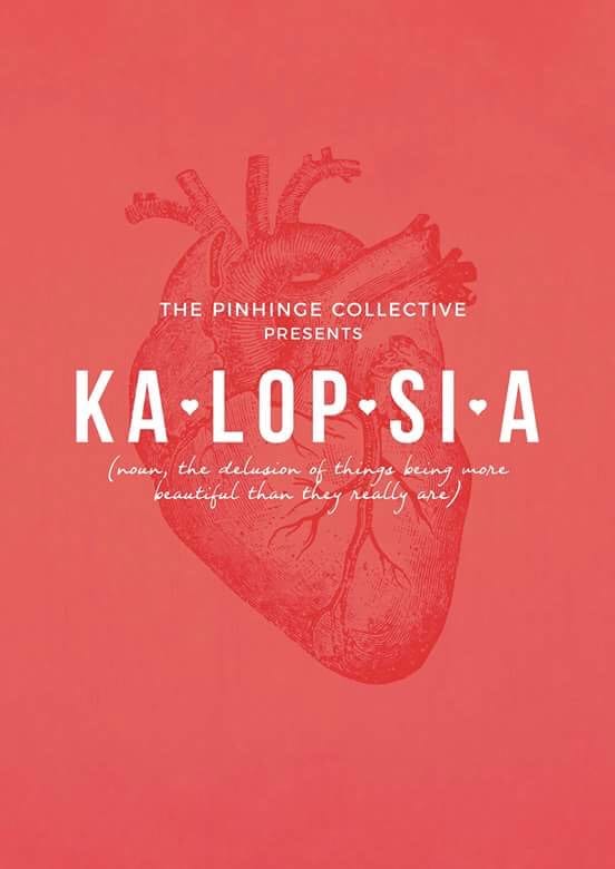
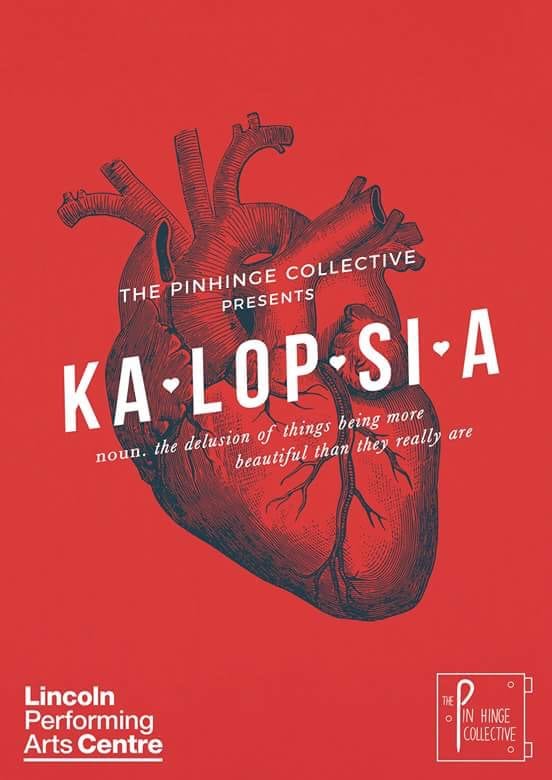
We agreed that the anatomical heart both showed the idea of love, the idea of reality as opposed to the delusion (a cartoon heart – shown in the title) and the idea of humanity. We wanted to have the title of the show resembling a dictionary definition as we knew many people wouldn’t know what Kalopsia meant, and to tell them how to say it through phonetically breaking it up. We also agreed that having the definition under the title would also give people an insight into what the show was about, as well as adding a recognisable yet ‘quirky’ twist. From here, we are to finalise a design and get it completed, as well as creating the final copy and back of the flyers for our shows, and getting it all printed! We have set aside a printing budget of £100 which we will hopefully stick to, but since our designer was in-kind we have some leeway to go over this if needed.


All You Need is Love – We’re Only Human After All

As The Pin Hinge Collective, we knew we wanted to make a piece of theatre about what makes us human. What it is that ‘pins’ us together.
At this stage in time this was all we knew, but every process must have a beginning and this was ours.

After much artistic discussion, with a chorus of nine voices all with different ideas wanting to be heard, we came to the agreement that the show should include a plethora of human identities.

We asked the questions: What makes us human? What factors can influence who we are?

In response to our questions, we decided on four factors which can influence who we are as people.

  • Upbringing and Masculinity
  • Education
  • Disability
  • Relationships and Sexuality

After a lot of storyboarding and story-sharing, we created characters and narratives for each of our chosen factor.

We began by jotting ideas down for ‘Upbringing and Masculinity’. After hearing Dwain tell us a story from his childhood about a fishing trip with his dad, we were inspired to think about how traditional values of masculinity are imprinted in young boys from a very early age. We also spoke about how these traditionally masculine values are often passed along through the generations and can sculpt people into who they are.

After sharing an overwhelming amount of ideas and stories for each of the other human factors, we realised that we were trying to fit too much into a single fifty-minute show.

Back to the drawing board…

We have all experienced the feeling of love and that’s what all our ideas kept coming back to. Love.

With a completely new and inspiring idea, we each went away and thought about what the word ‘love’ meant to us. We brought back stories, scrapbooks and silly anecdotes to show our individual perceptions of love.

After being inspired by a story Emily told about her grandparents meeting and falling in love, we began to craft the opening of our show.

We wanted to create a physical movement office scene set in the 1950s showing a whirlwind romance between a typist and a handyman, eventually ending with the man leaving his wife for another woman.

As costume designer, I was immediately inspired by the 1950s setting. It’s an era which I have always been very interested in. I adore the hair, the clothes and the music!

I stared researching the typical office wear for women of the time. Pencil skirts were very popular for women to wear in the office, they showed off an hourglass figure and were often paired with cropped jackets.

typist

I decided that the typist should stand out in the scene and after discussing her character with the group, we decided that she should wear something more fun to match her personality. A pencil skirt would be too severe for her character and too difficult to move in for the physical nature of the scene.

Circle skirts were also very fashionable in the 1950s. They were long circular skirts often worn with petticoats underneath. Poodle skirts were also very popular for young ladies of the era. They were a similar shape to circle skirts, but were embellished with cute little designs in shapes such as martini glasses and poodles. I felt that a skirt in one of these styles would be very suitable for the typist character. It would allow easy movement and suit her sweet youthful character. I would pair the skirt with a button up blouse, typical of the era, in either white or a pastel colour.

circle skirt             poodle skirt

I researched how handymen would have looked in the 1950s, all the photos I found showed them in white or blue overalls. I decided that the handyman and the typist should be the only characters in the scene to have costumes which differ from the matching 1950s office wear which the rest of the cast would wear.

The ‘other woman’ is the only other character who would wear a stand-out costume. The handyman’s new woman would wear a very contrasting costume to the typist’s. Whilst the young typist would wear a youthful and innocent style, the new woman would wear a costume in a much sexier and mature style.

Wiggle dresses were very tight fitting, causing the woman to wiggle as she walked. The dress reached down to the calf in a typical 50s style. The new woman would wear lipstick in a sexy shade of red, demonstrating the contrast between her and the younger typist.

marilyn