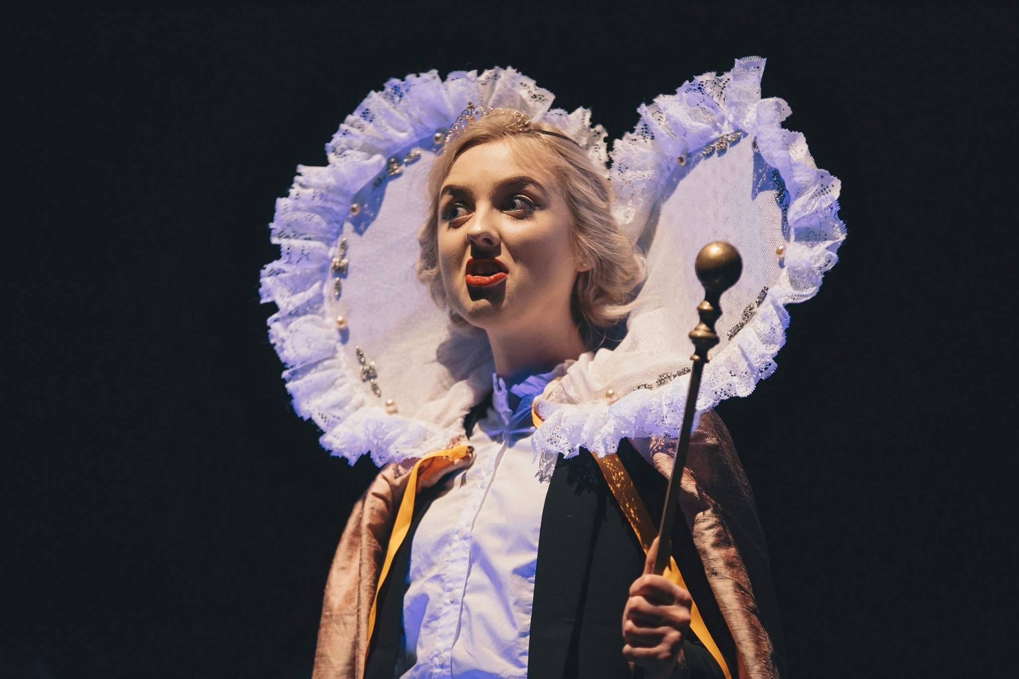
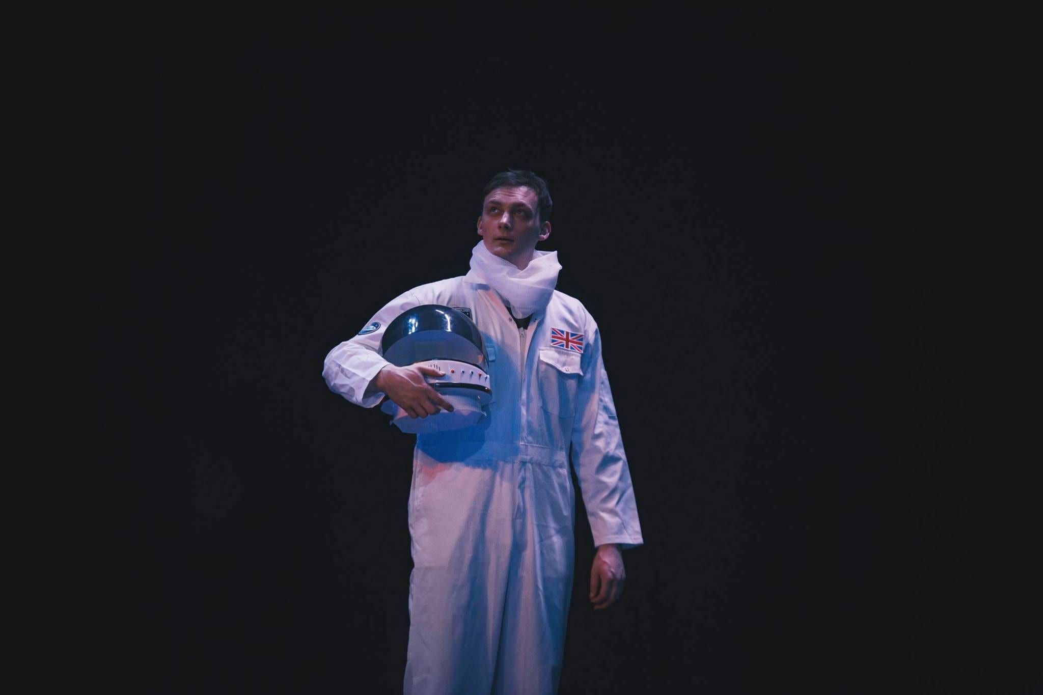
Tom, the Handyman, wants to be an engineer. He wants to build something brilliant.
His delusion has taken the form of a physical theatre scene with him as the spaceman protagonist.We have spent weeks creating a beautiful piece of space movement and I wanted my costume design to match the movement we have created.
A pair of white overalls…
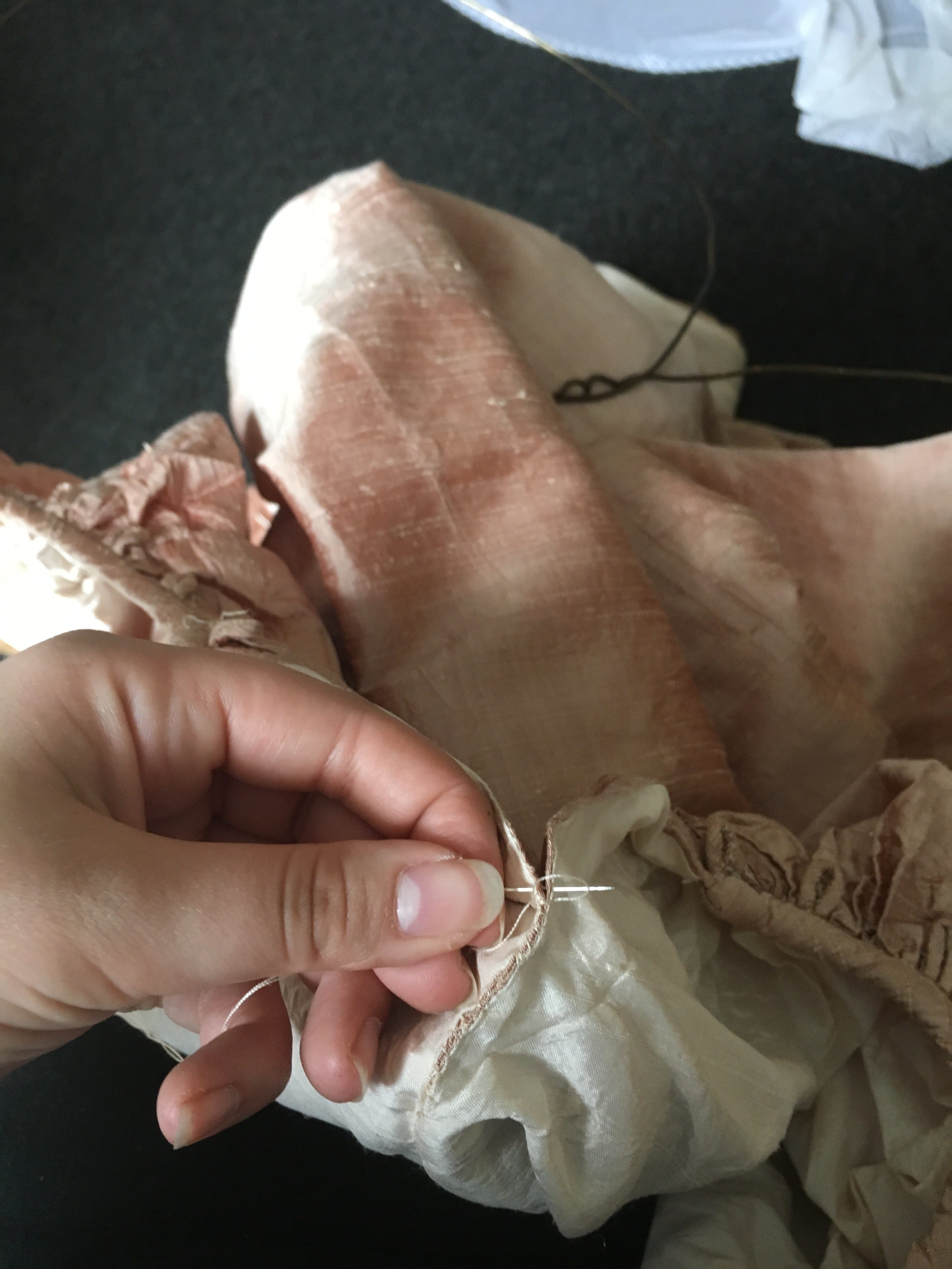
I knew that Sam would need to be able to move freely in his costume, so I had to consider this in my design whilst maintaining my desired appearance for the spacesuit. I also wanted to echo his ‘real life’ costume by having his spacesuit as a pair of white overalls similar to the blue ones he wore in the original scene.
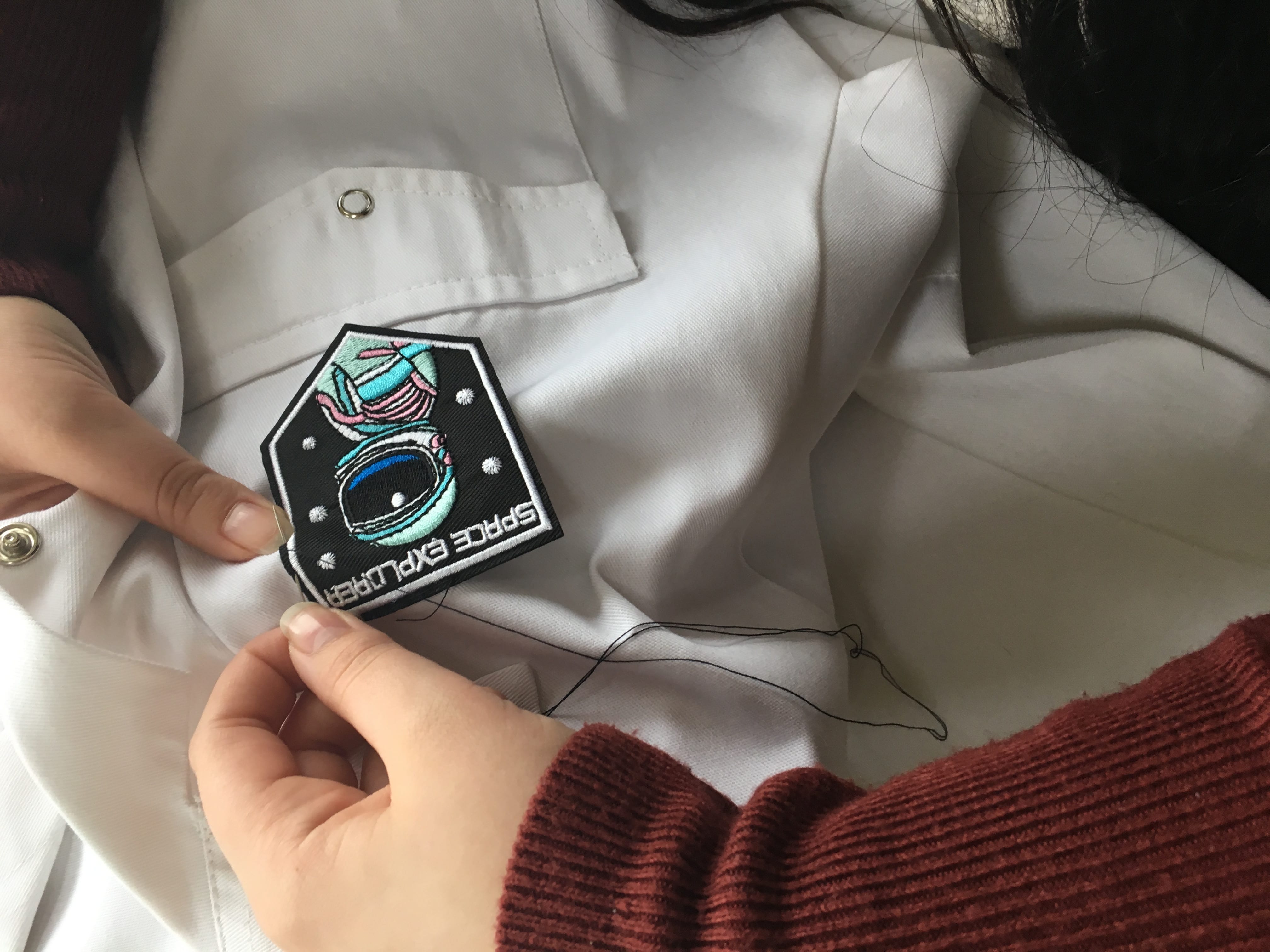
I found some sew-on space patches on eBay which I thought might add a nice finishing touch to the white spacesuit.
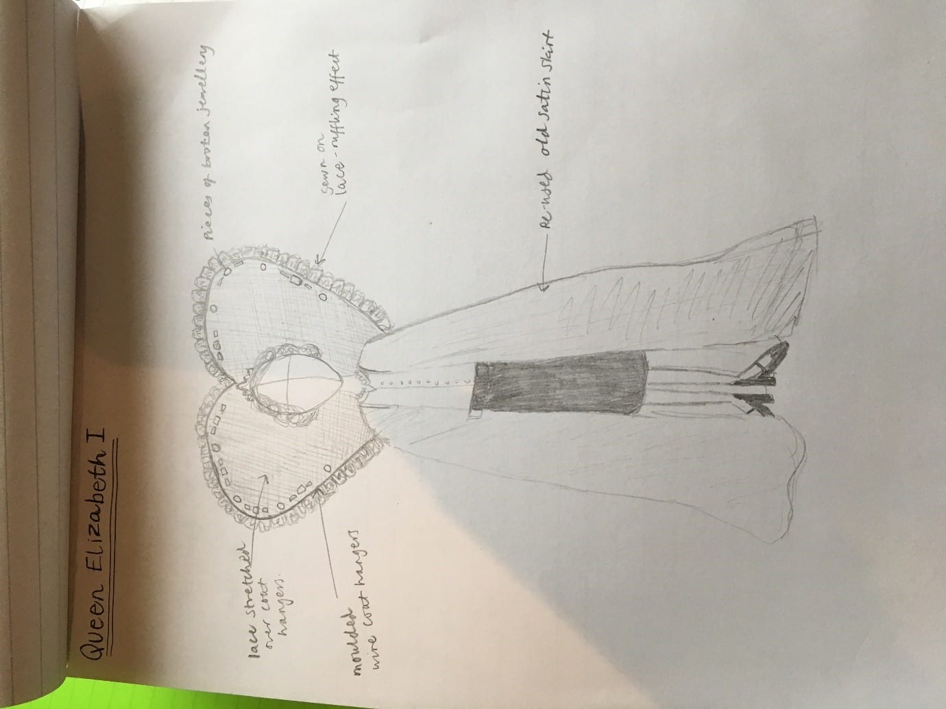
I drew out a design as I thought about how I might like the costume to turn out:
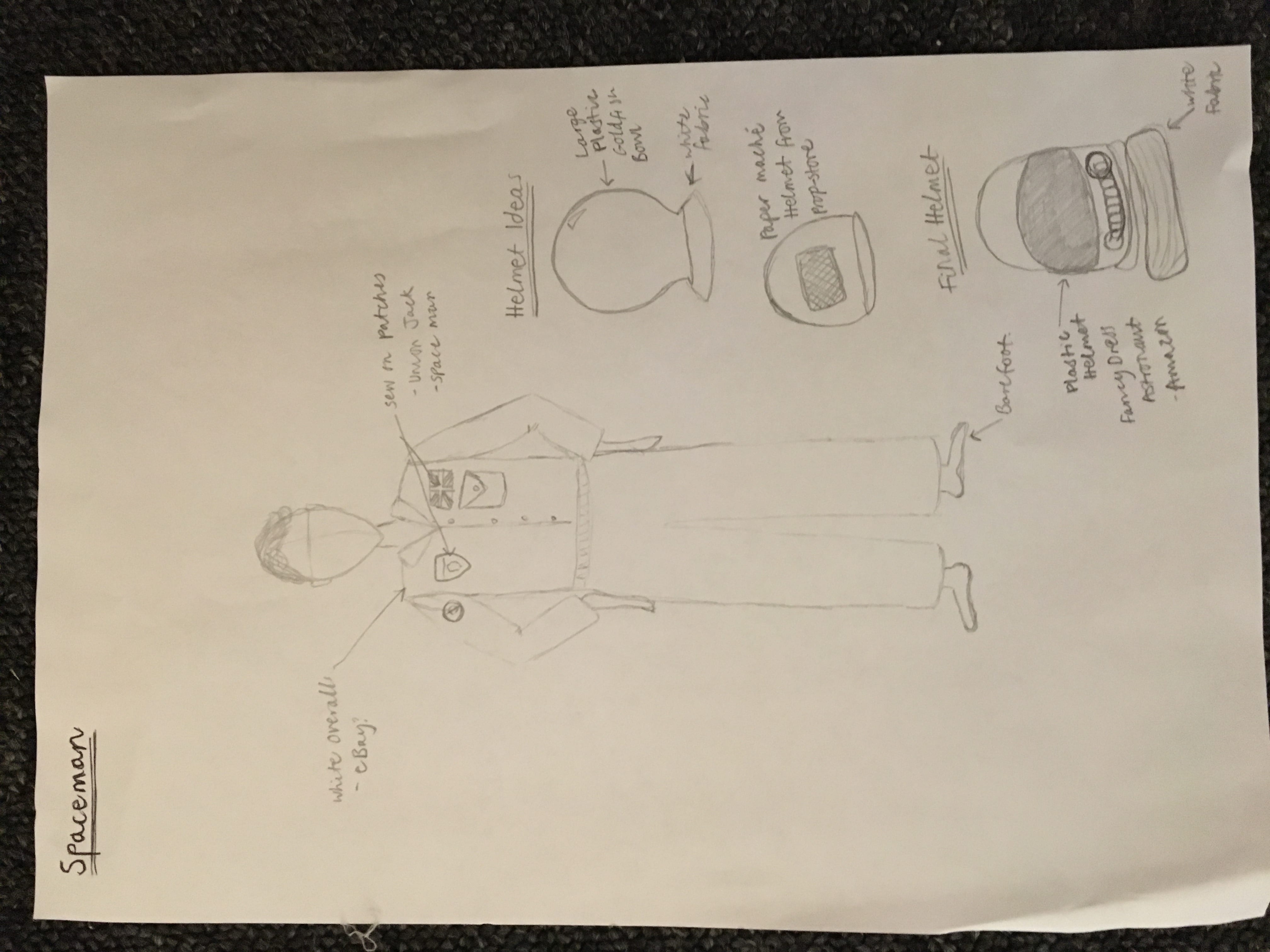
I found a very reasonably priced pair of white overalls on eBay and bought the sew-on patches. I stitched the space patches and union jack patch to the suit by hand.
UV Stars…
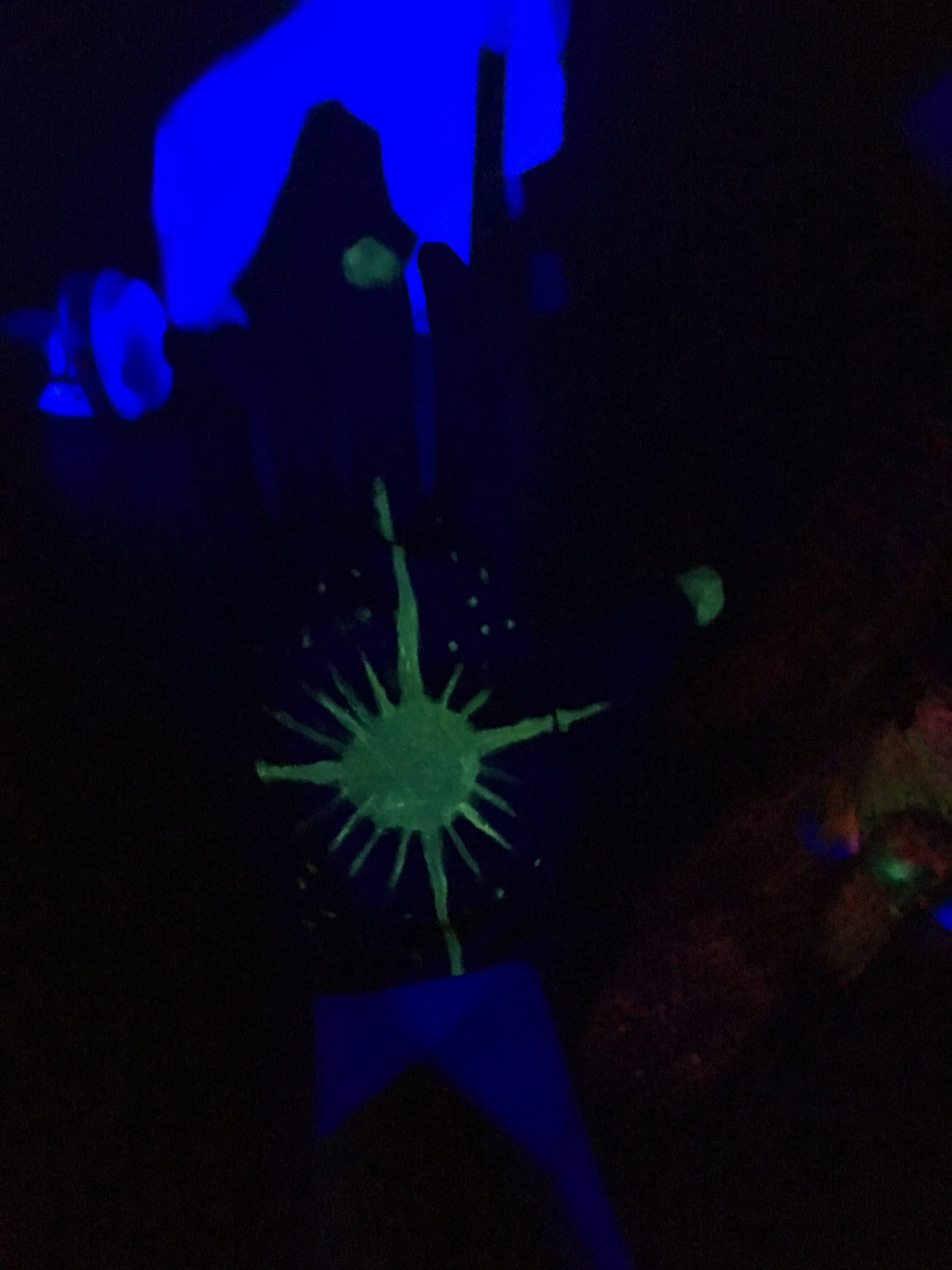
Our Stage Manager, Dan suggested using UV paint to create star gloves and a galaxy suit for our Choreography, Holly. I found a bulk pack of black mime gloves and began creating the UV gloves with fabric paint.
For our technical trial session, I painted one glove with the UV fabric paint with the white paint. Under the ultraviolet light the white paint was difficult to see. I tried painting over the star design with yellow paint and the star showed up very well under the lighting.
For Holly’s galaxy costume I bought a pair of black leggings and a black long-sleeved top and painted star designs all over them in the UV paint. I added a black mask and gloves which I had also painted. The design looked effective under the ultraviolet light. The stretchy leggings and top also made it easy for Holly to move.
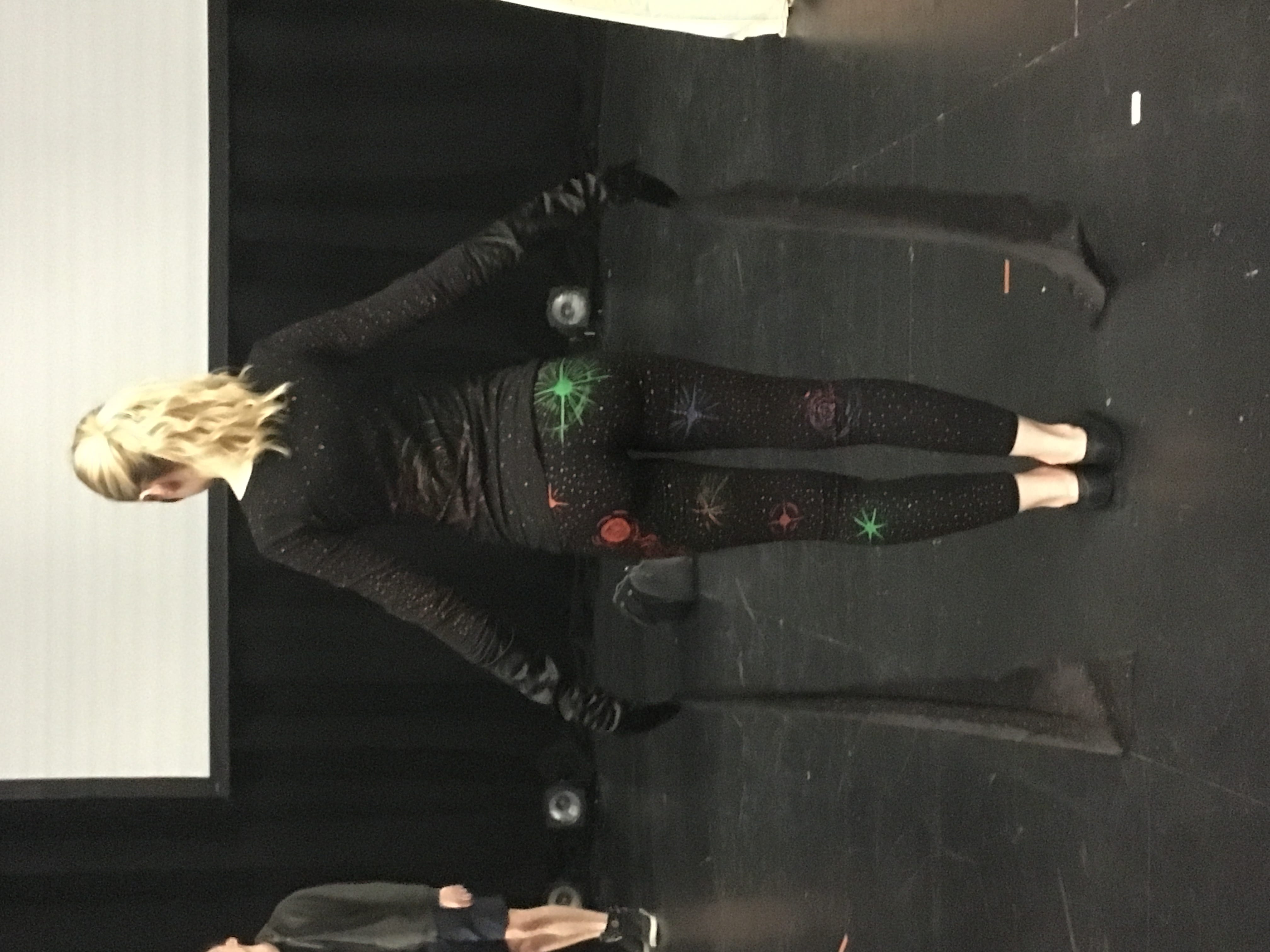
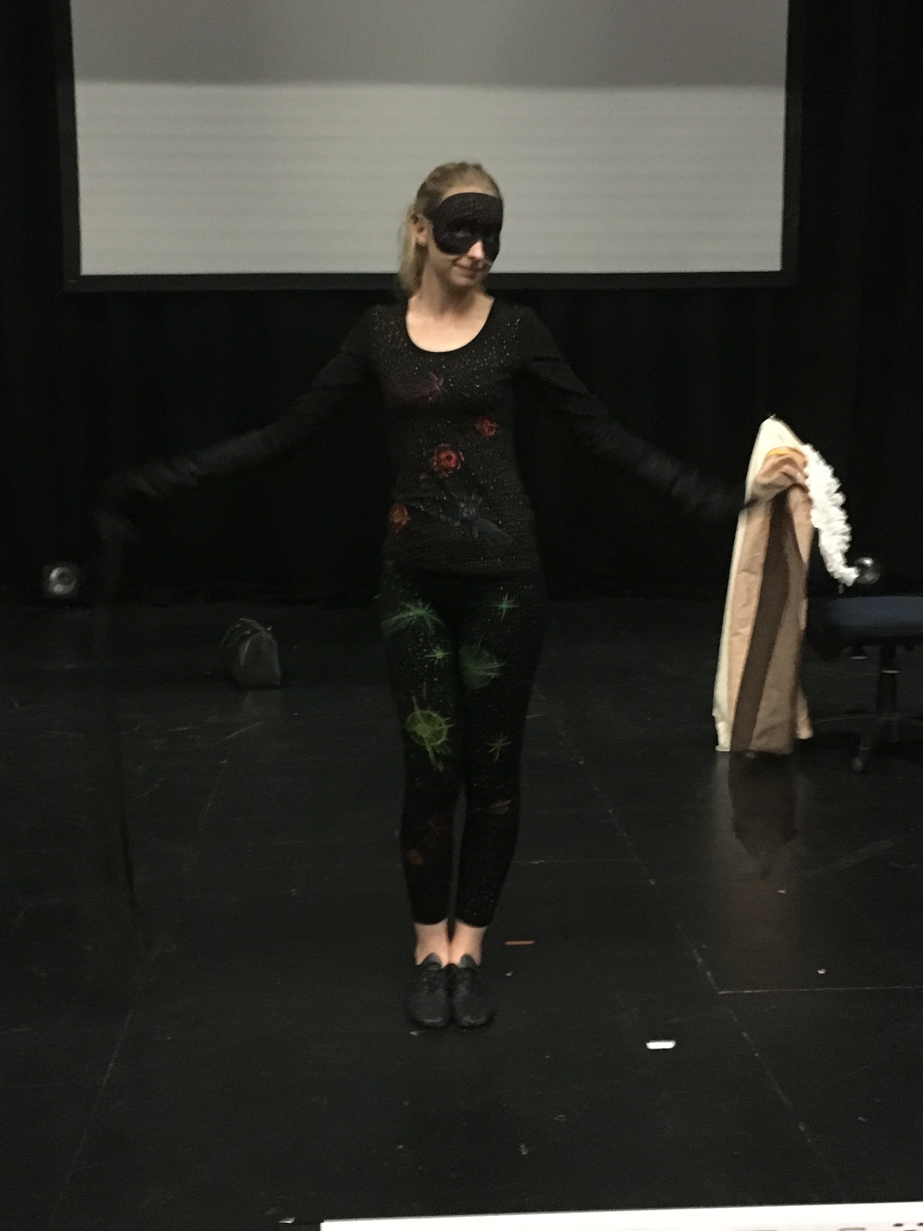
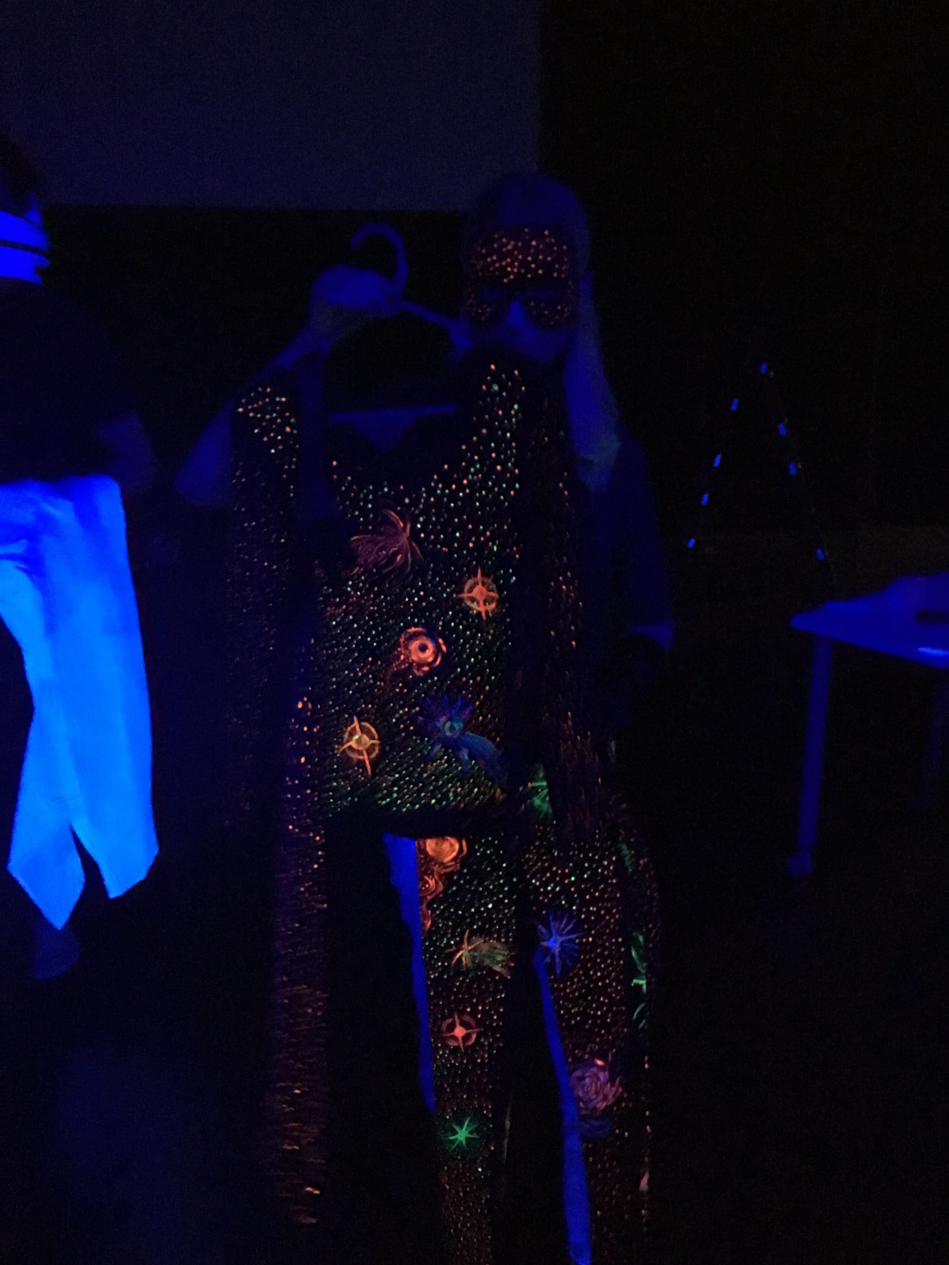
The ultraviolet fabric paint costumes took a long while to make but I feel that the end result really made the hard work pay off. The gloves stood out against the black background and Holly’s costume shone under the lighting. I’m pleased the paints worked as I hoped they would.
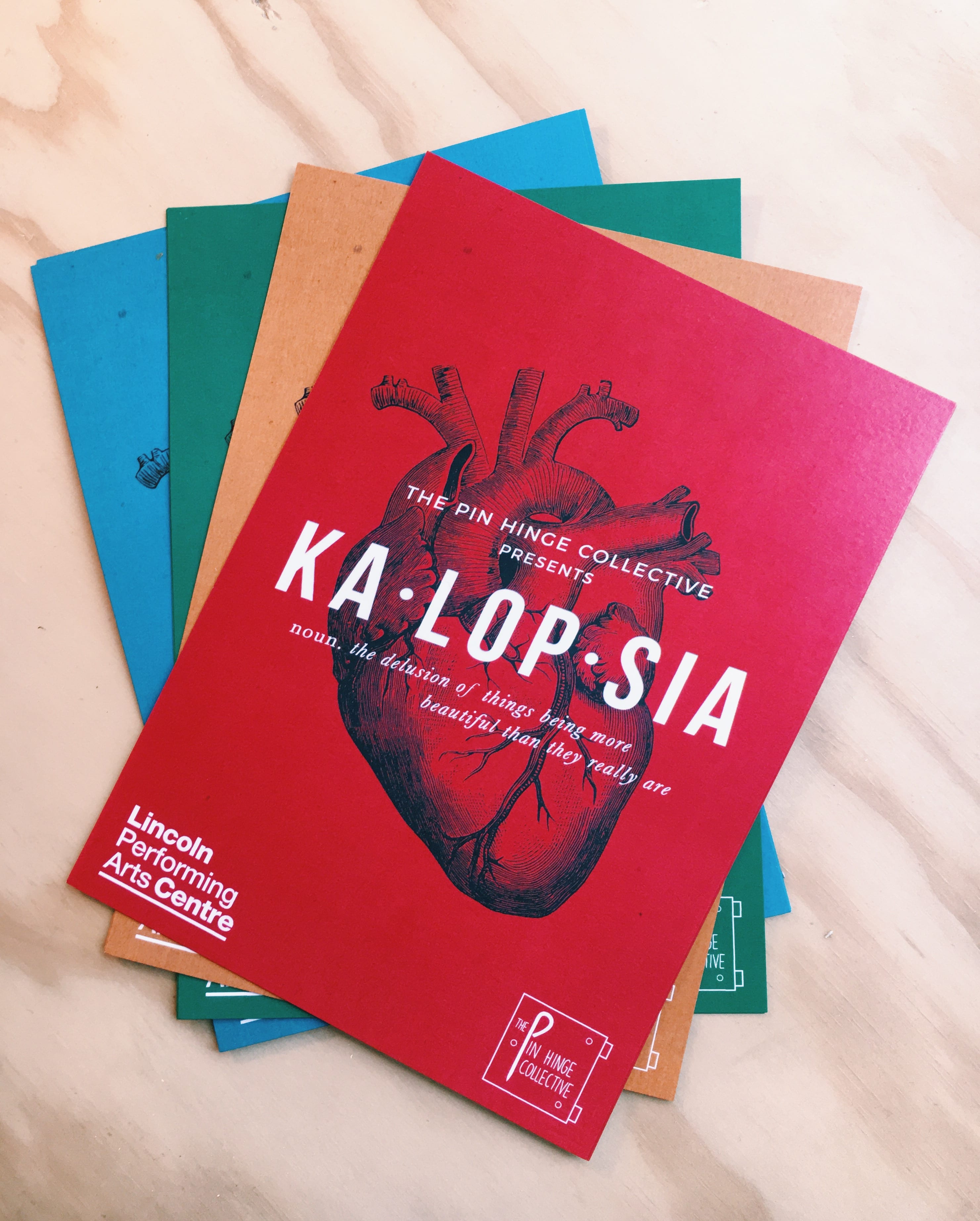
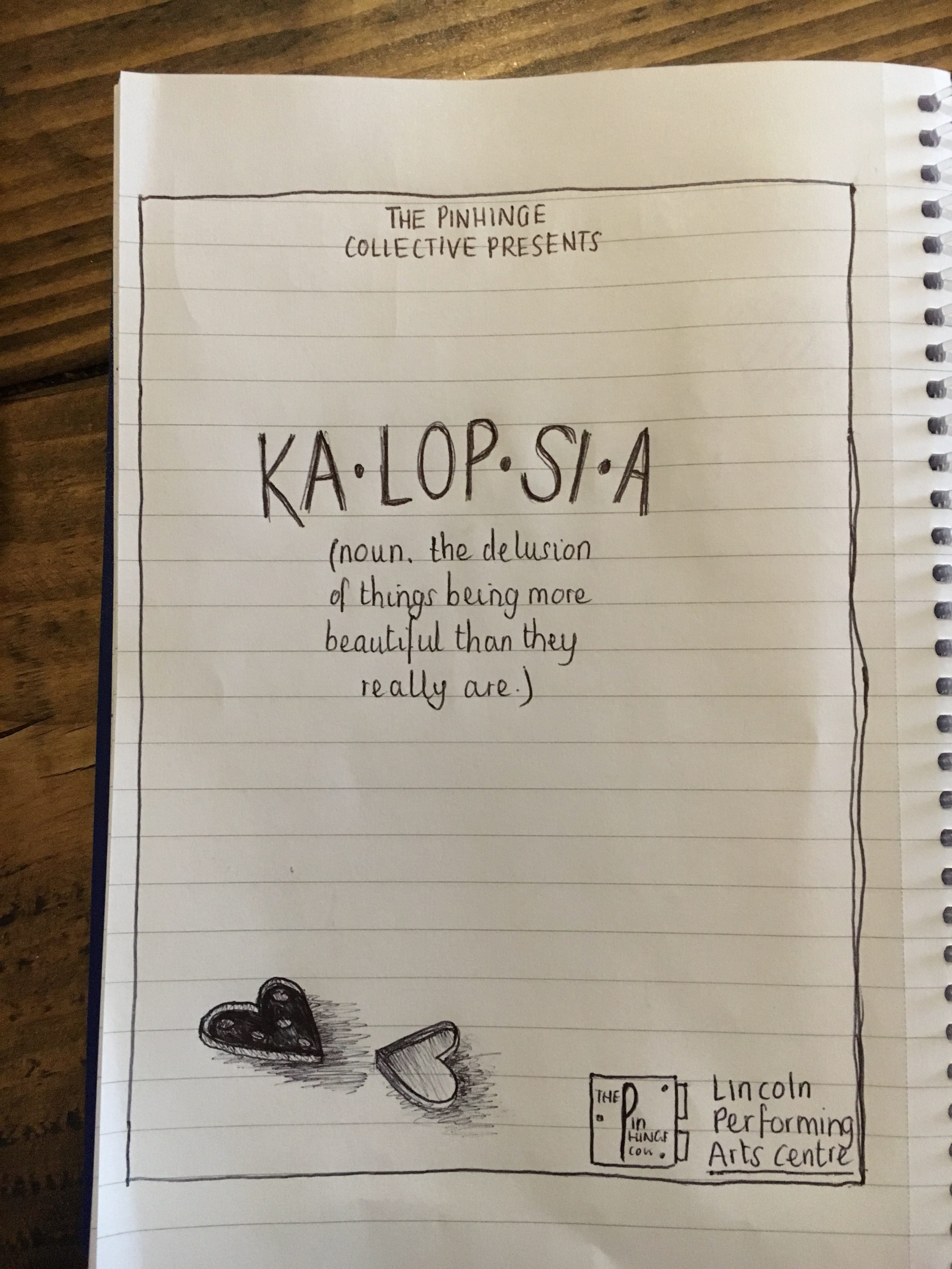
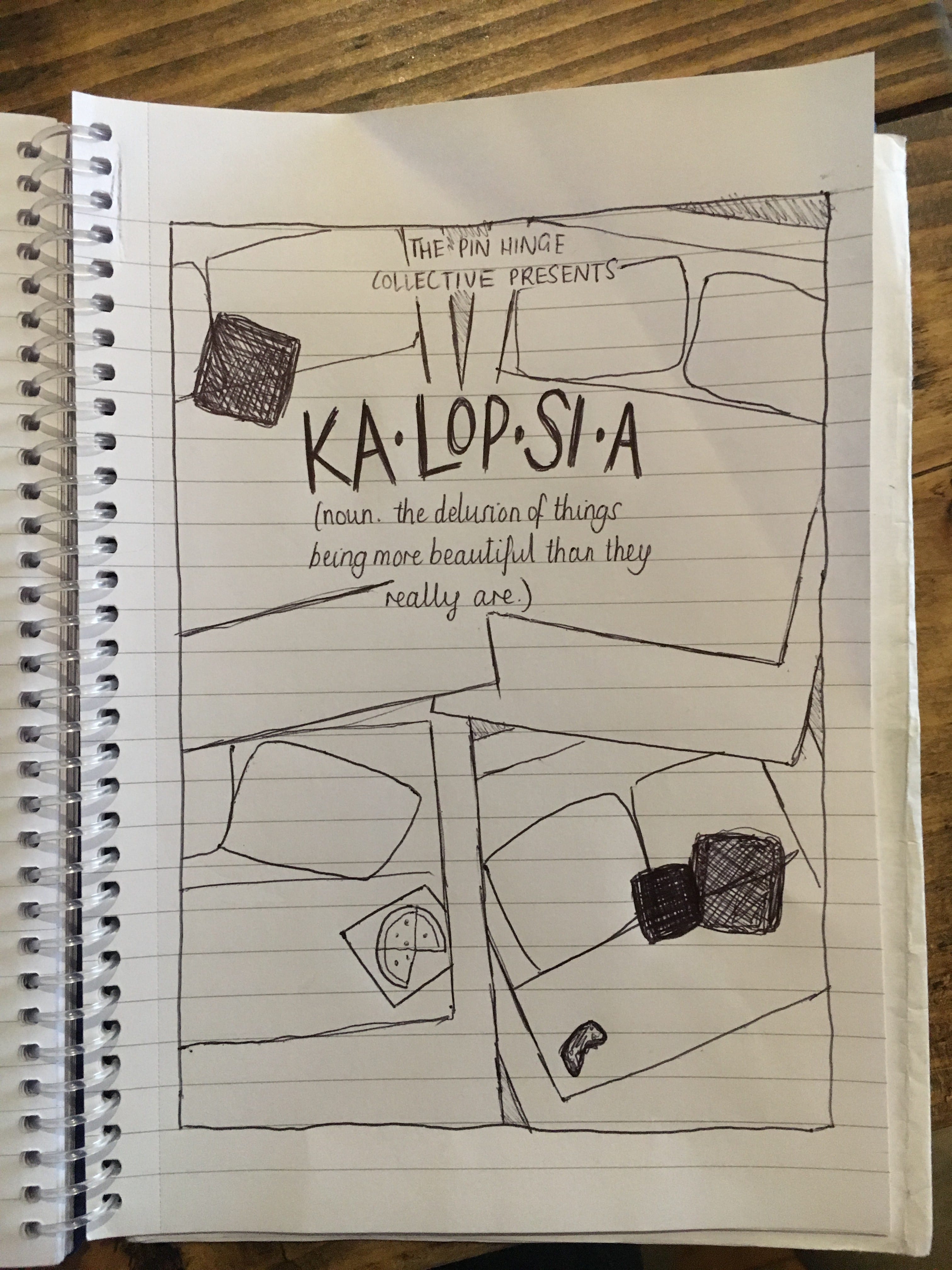
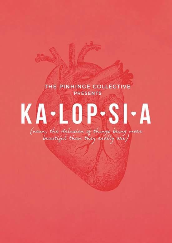
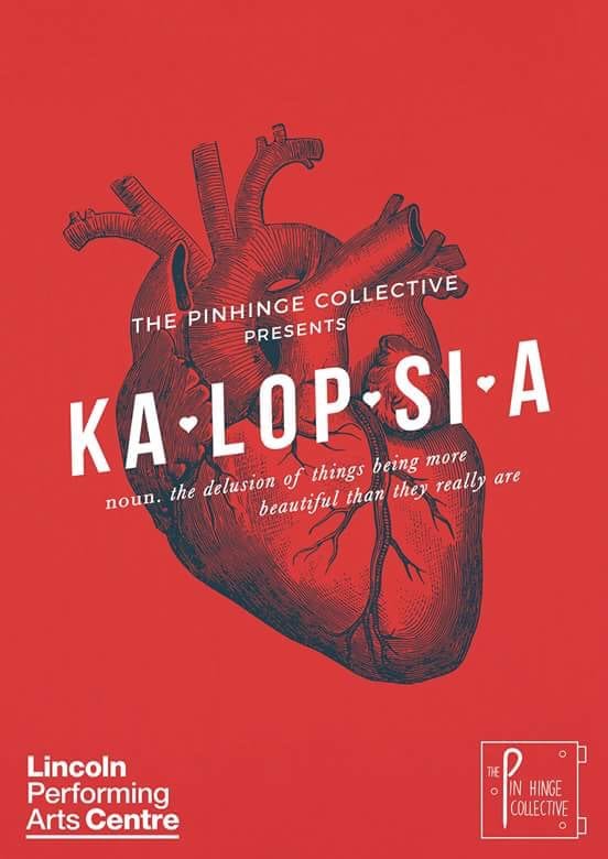
Howard Rees-Jones, G. (2017) Kalopsia. Lincoln: George Howard Rees-Jones Media.