It’s just 2 weeks away from our performance now, and our print has been finalised and is being distributed!
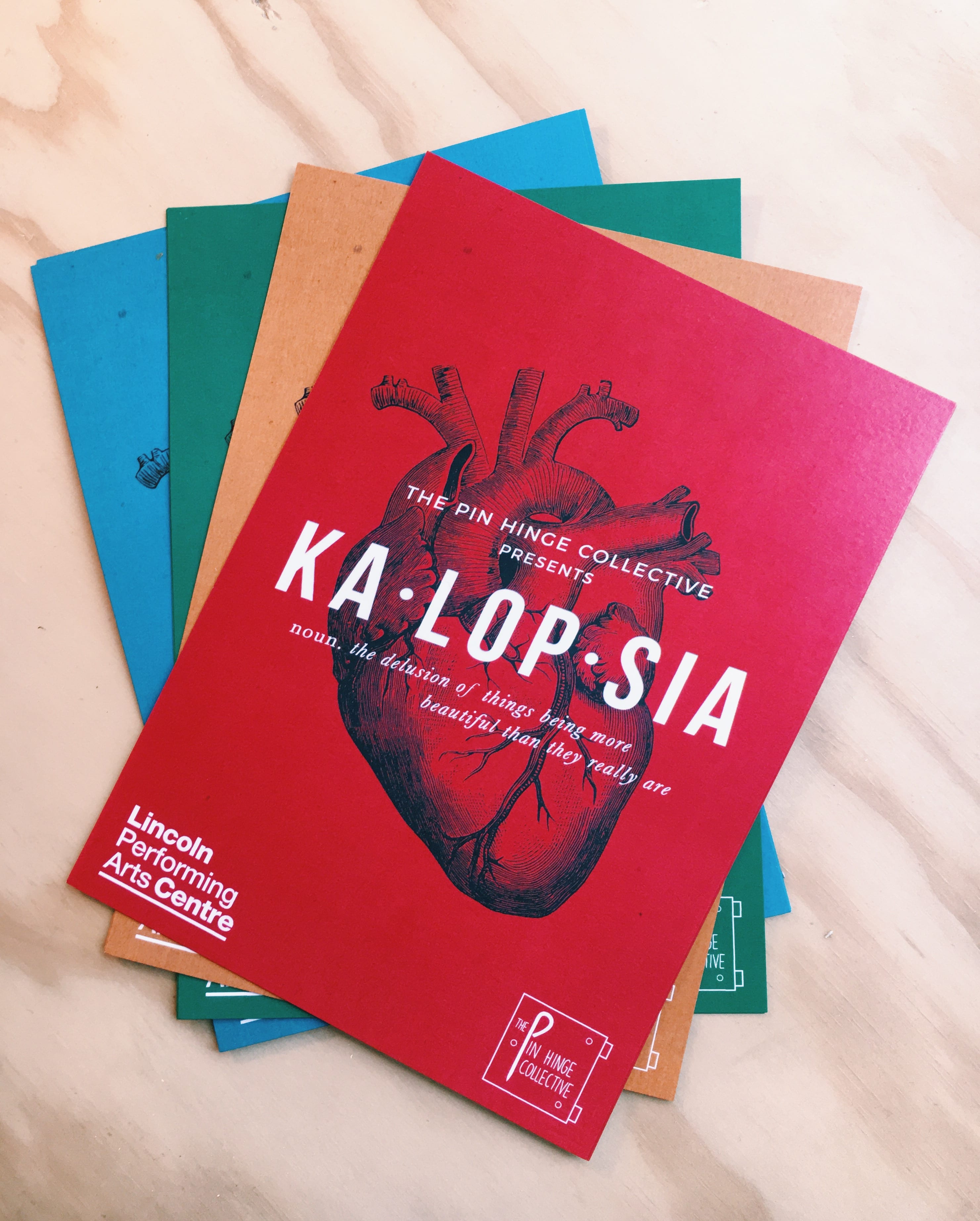
In regards to our flyers, I made the decision to have our design printed in different colours. I did this to ensure they were eye-catching and appealing to different people, as whilst it is widely known that red reaches the back of the retina first (hence why I chose it for our poster design), different people are drawn to different colours based on their personality. This is in-keeping with the theme of individuality and expression running through our show, reflecting the idea that different people view the world very differently. I believe these colours all complement each other and stand out both on their own and in a set, and I hope to test this theory when we distribute them in town and around the university campus.
Our posters are beginning to pop up around the city; I have made sure that they are put in places relative to our target audience to ensure maximum reach and that this correlates with ticket sales – there’s no point putting them in places our audience will not visit! A prime location for our type of audience is independent coffee shops, and many owners have been very keen to put up posters and flyers as they are driven to help promote emerging companies/the arts!